

In this definitive 2026 guide, Huipsov Oy walks you through core principles for a truly scalable UI/UX framework: content-first approach, fluid grids, and a modern design-to-code workflow that reduces maintenance and delivers superior Core Web Vitals.

In today’s digital landscape, the user experience often feels fractured. As your product is viewed on foldable screens, smartwatches, and ultra-wide monitors, the traditional approach to responsive web design can feel like a complex puzzle for your team. The pressure to deliver a flawless experience on every device often leads to spiraling maintenance costs and performance bottlenecks, disrupting the calm and focus needed for true innovation.
What if you could build a single, harmonious digital foundation that adapts gracefully to any screen? This is the promise of a modern, forward-thinking design philosophy. It’s more than just a technical fix; it’s a strategic approach to creating calm, consistent, and high-performing user experiences that feel effortless for your audience and sustainable for your team.
In this definitive 2026 guide, we at Huipsov Oy will walk you through the core principles needed to build a truly scalable UI/UX framework. We’ll explore how a unified codebase can significantly reduce your maintenance overhead—freeing up budgets potentially worth thousands of euros annually—and achieve the superior Core Web Vitals scores essential for growth. Let’s build a digital future that is as resilient and adaptable as your vision.
Key Takeaways
- Understand the strategic shift from a ”mobile-first” to a ”content-first” approach to future-proof your digital product’s architecture.
- Analyze the development costs in CHF and user acquisition models of websites versus native apps to make the most strategic choice for the Swiss market.
- Learn the core technical principles, like fluid grids and flexible media, that enable modern responsive web design to deliver a high-performance experience on any device.
- Discover a modern design-to-code workflow that ensures your project is built on a solid, scalable foundation from day one.
What is Responsive Web Design in 2026?
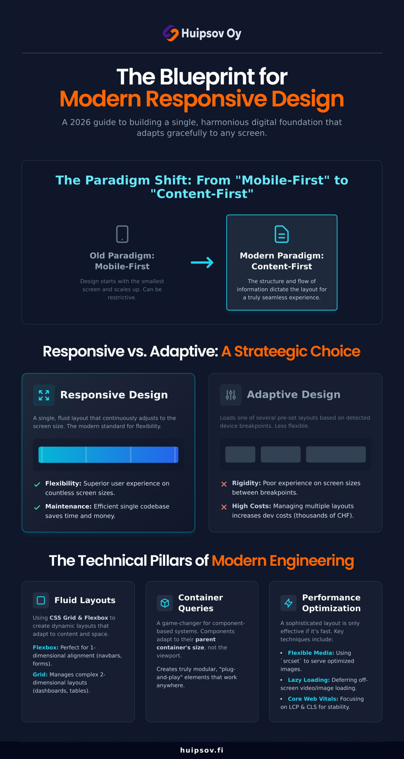
In 2026, responsive web design is no longer just a feature; it’s the fundamental architecture of a successful digital presence. At its core, it is a technical paradigm where a website’s interface fluidly adapts to the user’s environment—be it a smartphone, a tablet, or a desktop computer. The modern approach has evolved from a ”Mobile-First” to a ”Content-First” philosophy, where the structure and flow of information dictate the layout, ensuring a seamless experience on any device.
For Swiss startups launching an MVP or a SaaS product, a responsive foundation is non-negotiable. It directly impacts user acquisition and retention. A site that functions flawlessly across all platforms builds immediate trust and authority. This positive first impression is crucial for driving conversions, while a clunky, non-responsive experience is a leading cause of user churn, sending potential customers to your competitors.
The Evolution of the Responsive Paradigm
The web has moved far beyond the rigid, fixed-width tables of its early days. Today, modern CSS technologies like Flexbox and Grid are the standard, allowing for dynamic and flexible layouts. This evolution is vital as we design for an ever-expanding range of devices, from foldable screens that present unique aspect ratios to ultra-wide monitors used in many Swiss offices. The old goal of a ”pixel-perfect” design is obsolete; the new standard is ”fluid-perfect,” ensuring an optimal and consistent experience regardless of screen size.
RWD vs. Adaptive Design: Understanding the Difference
While often used interchangeably, responsive and adaptive designs are technically distinct. Responsive design uses a single, fluid layout that adjusts to screen size (client-side), whereas adaptive design loads a pre-set layout based on detected device breakpoints (server-side). For most growing businesses, the choice is clear:
- Flexibility: Fluid responsiveness provides a better user experience on the countless screen sizes between major breakpoints.
- Maintenance: Maintaining a single responsive codebase is far more efficient. An adaptive approach requires separate management for each layout, quickly increasing development costs, which can add thousands of CHF to your annual budget.
The Technical Pillars of Modern Responsive Engineering
Beyond simply shrinking a desktop site, true responsive engineering rests on a foundation of fluid architecture and intelligent adaptation. This approach ensures a seamless experience on any device. It’s built on core concepts like fluid grids using relative units (%, rem), flexible media that loads efficiently, and adaptive queries that reshape content based on context, not just screen size.
Mastering CSS Grid and Flexbox
These two CSS layout models are the workhorses of modern web development. Flexbox excels at aligning items in a single dimension, perfect for navigation bars and forms. CSS Grid manages complex two-dimensional layouts, allowing intricate dashboards and data-heavy tables to elegantly reorganize for smaller screens. A key advantage is source-order independence, which ensures content remains accessible and logical for screen readers, regardless of its visual presentation.
The Rise of Container Queries
While media queries react to the entire viewport, container queries are a game-changer for component-based systems like React or Vue. They allow a UI component—like a product card or a chart—to adapt based on the size of its parent container. This creates truly modular, ”plug-and-play” elements that look perfect anywhere you place them, dramatically reducing CSS complexity for sophisticated SaaS platforms.
A sophisticated layout is only effective if it’s fast. This is where performance optimization becomes a non-negotiable part of modern responsive web design. Techniques include:
- Flexible Images: Using the <picture> element or
srcsetattribute to serve appropriately sized images for different devices, preventing a smartphone from downloading a huge desktop graphic. - Optimized Video: Implementing lazy loading for videos below the fold to speed up initial page rendering.
- Core Web Vitals Focus: Ensuring a low Largest Contentful Paint (LCP) and minimal Cumulative Layout Shift (CLS) to provide a stable, fast-loading experience.
This focus on performance is crucial for satisfying both users and search engines.
Responsive Design vs. Native Apps: Strategic Analysis
For any Swiss business, the decision between a responsive website and a dedicated native application is a pivotal one, shaping everything from budget allocation to user acquisition. While a native app offers deep integration with device hardware, a strategy built on responsive web design provides unparalleled reach and efficiency. The choice is not merely technical; it is a fundamental business decision that balances development costs, market reach, and long-term maintenance.
Why RWD is the Default for MVPs
When launching a Minimum Viable Product (MVP), speed and learning are paramount. Responsive web design is the superior choice for this initial phase, offering a lean and agile foundation. This ”develop once, deploy everywhere” philosophy is a cornerstone of modern digital strategy. The core advantages include:
- Accelerated Launch: A single codebase serves all users, regardless of device, dramatically reducing time to market compared to building separate iOS and Android apps.
- Cost-Effectiveness: In a high-value market like Switzerland, avoiding the CHF 50,000+ cost per platform for native app development makes RWD a financially sound starting point.
- Seamless Iteration: Updates are deployed instantly without waiting for lengthy app store approval processes, enabling rapid response to user feedback.
- SEO Foundation: All traffic and authority are directed to a single URL, strengthening your online presence from day one.
SaaS-Specific Challenges in Responsive Design
SaaS presents unique challenges: translating intricate desktop interfaces into an intuitive mobile experience requires rethinking user flows for smaller screens. A hybrid approach often works best—Progressive Web Apps (PWAs) offer app-like features such as push notifications and offline access through the browser, bridging the gap between responsive reach and app-like experience.
Implementation Guide: A Modern Design-to-Code Workflow
Achieving a seamless user experience for your Finnish audience requires more than just code; it demands a thoughtful, structured workflow. This modern approach to responsive web design moves beyond static pages, focusing instead on creating adaptable digital systems that serve users on any device. A truly effective process is iterative and collaborative, ensuring the final product is both beautiful and fundamentally functional. The journey can be broken down into five core phases:
- Phase 1: Content Inventory and Information Architecture. Before any design begins, understand your message. A content inventory clarifies what you need to communicate, while a solid information architecture (IA) organizes it logically. This content-first approach ensures the design serves the information, not the other way around.
- Phase 2: Low-fidelity Wireframing. Focus on hierarchy and flow, not aesthetics. Low-fidelity wireframes map out the user journey and establish the relative importance of elements on different screen sizes, ensuring key information is always accessible.
- Phase 3: Prototyping Fluid Transitions. Move beyond static images. Modern tools allow for creating fluid prototypes that demonstrate how the layout adapts between breakpoints. This helps stakeholders feel the user experience before development begins.
- Phase 4: Collaborative Engineering. Bridge the gap between design and development with a shared design system. Reusable components, defined styles, and clear guidelines ensure consistency and dramatically accelerate the development process.
- Phase 5: Automated Testing for 2026. Prepare for the future. As the device landscape evolves, automated testing tools can simulate a vast range of devices, browsers, and network conditions, ensuring your site remains robust for all users.
AI is becoming an invaluable partner: generating optimized responsive CSS, compressing media for mobile, and assisting in QA across device configurations. Thorough testing must include real devices and simulators, performance profiling for low-bandwidth users, and adherence to WCAG 2.2 accessibility standards.
Scaling Your Product with Huipsovs Engineering Excellence
Understanding the importance of a flawless user experience is the first step. The next is partnering with an engineering team that can bring that vision to life with meticulous execution. At Huipsov Oy, we build digital products where principled responsive web design is an integral part of the architecture, not an afterthought. Our commitment is to create secure, scalable, and high-impact software that performs beautifully on every device used by your Finnish audience.
Partnering with our Helsinki-based team means you gain:
- Strategic Scalability: Technology architected to grow seamlessly with your business.
- Uncompromising Security: Protecting your data and user trust from day one.
- High-Impact Performance: Fast, reliable, and engaging digital experiences.
- Expert Augmentation: The ability to add our responsive design experts directly to your team.
Custom Software Development in Helsinki
We combine deep local market understanding with a global mindset, upholding the legacy of world-renowned Finnish design—clean, functional, and deeply user-centric. For startups, we help you launch and scale your MVP without compromising on quality, embedding robust responsive web design from the initial build. Ready to build a digital product that resonates with users and scales for success? Schedule a consultation with our Helsinki team.
Your Future is Fluid: Building a Lasting Digital Presence
The digital landscape of 2026 demands more than a mobile-friendly site. True success lies in a deeply integrated, performant experience across every user touchpoint. From the technical pillars of modern engineering to the strategic choice between web and native applications, your decisions today define your product’s scalability and market reach. A forward-thinking approach to responsive web design is not just a technical task—it’s a core business strategy. The Helsinki-based engineering team at Huipsov specialises in building scalable, high-performance SaaS and AI-powered products. Build your responsive digital product with Huipsov and let’s engineer a seamless future for your users, together.
Frequently Asked Questions
What is the main difference between responsive and adaptive web design?
Responsive design uses a single, fluid layout that dynamically adjusts to any screen size. Adaptive design uses pre-designed, fixed layouts for specific device sizes; the server detects the device and delivers the appropriate layout. For modern standards, responsive design provides a more seamless and future-proof solution.
Is responsive web design still necessary if I have a mobile app?
Yes. Your website is often the first point of contact for new customers. A responsive website ensures a positive first impression and captures the widest audience. Your site is your universal digital front door; your app serves your most loyal customers. Both are crucial for a complete digital strategy.
How much does it cost to implement responsive web design for a SaaS product?
In Switzerland, for a relatively simple SaaS product, retrofitting might cost CHF 5,000 to CHF 15,000. For a complex platform requiring a complete redesign or custom development from the ground up, the investment could range from CHF 20,000 to over CHF 70,000, depending on screens, interactions, and scope.
Will responsive design negatively affect my website performance?
When implemented correctly, responsive design should enhance performance. Modern techniques like appropriately scaled images, lazy loading, and optimised code ensure mobile devices only download what they need. A slow site is typically from poor optimisation, not responsive principles.
Can I turn an existing non-responsive website into a responsive one?
Yes, through ”retrofitting”—rewriting CSS and potentially altering HTML to make the layout fluid. Depending on the age and complexity of the codebase, this can sometimes be more challenging than a complete rebuild. A technical audit can determine if retrofitting or redesigning is more cost-effective.
What are the most important breakpoints to consider in 2026?
Best practice is shifting to content-driven breakpoints, where the layout adapts when content looks crowded. For a foundational strategy, plan around: small under 600px (smartphones), medium 600–900px (tablets), large 900–1200px (laptops), and extra-large above 1200px.
How does responsive web design impact my SEO rankings in Switzerland?
It has a significant impact. Google uses mobile-first indexing, primarily evaluating the mobile version for ranking. A site that is not mobile-friendly will be penalised on Google.ch. A solid responsive design ensures a positive experience on all devices, which is a strong quality signal for search engines and fundamental for organic performance in the Swiss market.